
Grid System
The grid keeps tokens, props, and map tiles aligned. Each map page has its own grid type, cell size, and color, so a game can mix tactical maps, hex maps, and freeform scenes.
Choose a Grid
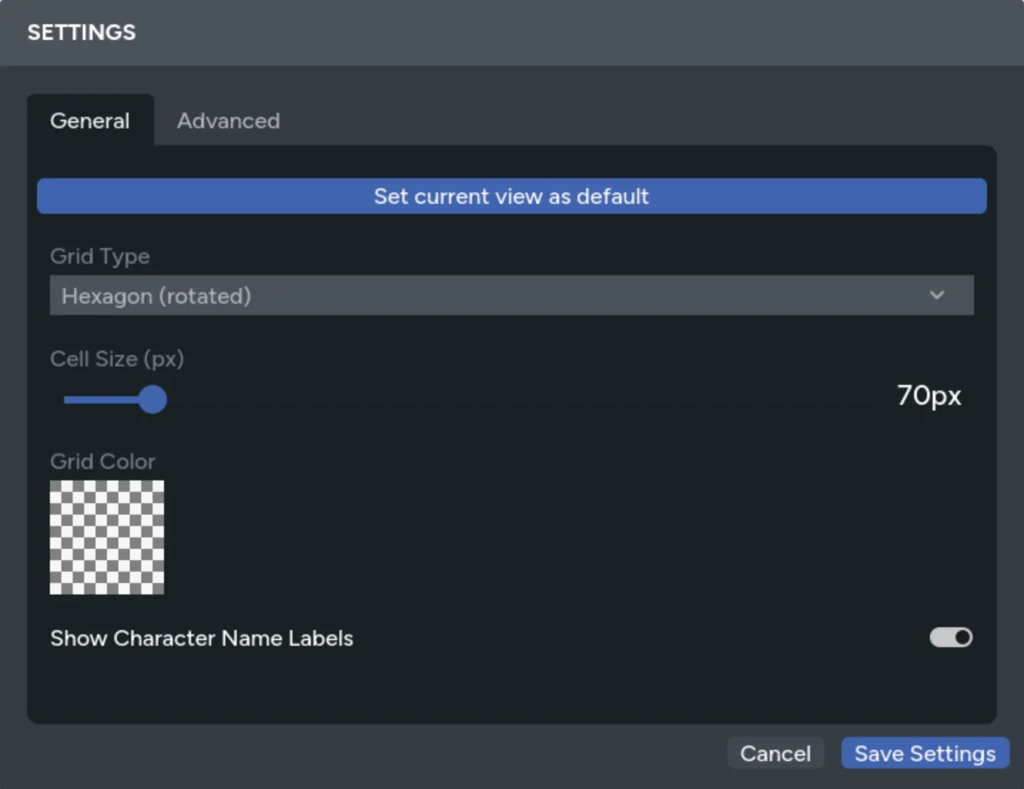
Section titled “Choose a Grid”Open Settings and choose one of these grid types:
- Square for square-cell tactical maps
- Hexagon for pointy-top hexes
- Hexagon (rotated) for flat-top hexes
- None for free placement without grid snapping


Set the cell size to match the scale of the background or map tiles. Use the color picker and opacity control to keep the lines visible without covering the art.
Changing the grid updates the current page for everyone at the table.
Move Assets on the Grid
Section titled “Move Assets on the Grid”Hold Shift while dragging an asset to snap it to the nearest cell. Assets that cover several cells align to the grid based on their footprint.
With an asset selected:
- Press an arrow key to move it by one cell.
- Hold
Shiftand press an arrow key to move it by five cells. - Hold
Shiftwhile resizing to snap its size to grid increments.
Without Shift, dragging and resizing stay freeform even while the grid is visible.
Use Grid Tools
Section titled “Use Grid Tools”Select one or more assets to open the Grid Tools actions.
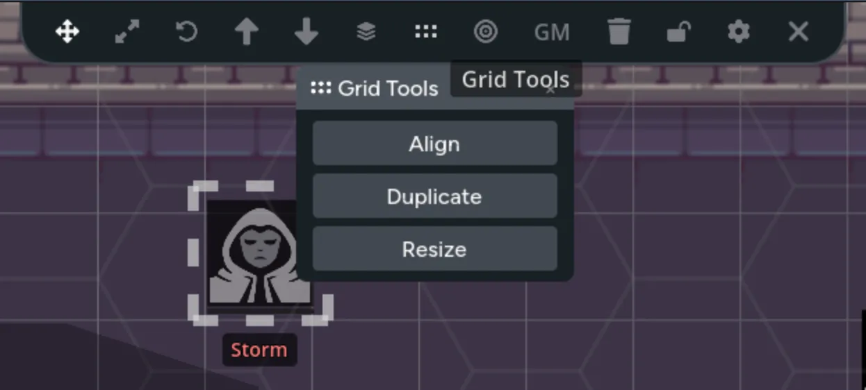
Align to Grid
Section titled “Align to Grid”Moves each selected asset to the nearest cell. When several selected assets would land in the same cell, Maps spreads them into nearby cells.
Resize to Grid
Section titled “Resize to Grid”Scales each selected asset proportionally to fit one cell, then centers it in the nearest cell.
Duplicate in a Direction
Section titled “Duplicate in a Direction”Creates copies above, below, left, or right of the selected assets at one-cell intervals. Choose a direction and the number of copies.
This is useful for repeated floor tiles, walls, trees, seats, or other regular map elements.
Auto-Resize New Assets
Section titled “Auto-Resize New Assets”Enable auto-resize in the Asset Library to fit newly placed assets into one grid cell. Existing assets aren’t changed when you turn the setting on.
Build a Tiled Map
Section titled “Build a Tiled Map”- Set the cell size to match the tiles.
- Enable auto-resize to grid.
- Place the first tile from the Asset Library.
- Use Duplicate in a Direction to build rows and columns.
- Flip repeated tiles with
Shift+ForShift+Vfor variation. - Move the finished background pieces onto a locked layer.
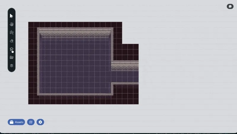
You can split a packed tile image before building. See Spritesheet Import.
Fix a Misaligned Grid
Section titled “Fix a Misaligned Grid”- If a printed grid is part of the background image, adjust the cell size until both grids match.
- If tokens don’t land where expected, check whether the page uses square, pointy-top hex, or flat-top hex cells.
- If the grid hides the art, lower its opacity or choose a closer color.
- If background pieces keep moving during play, put them on a locked layer.